EACH Website UI
Implementing a UI Design System & Brand Integration
Interface Design
Website Design
Design Systems
Goals
01
Develop a modular design system for rapid, consistent page creation with minimal visual drift.
02
Embed Each's brand into the UI for a distinctive, cohesive, and engaging experience.
03
Design adaptable components for reuse across various contexts and device platforms.
04
Ensure the design system translates seamlessly into code, facilitating smooth handoff and maintenance.
The Approach
Superunknown brought Bluntmedia in to lead the web UI and design-system integration. They had already shaped the core experience through extensive content wireframes and low-fidelity layouts, and had the foundations of a brand style.
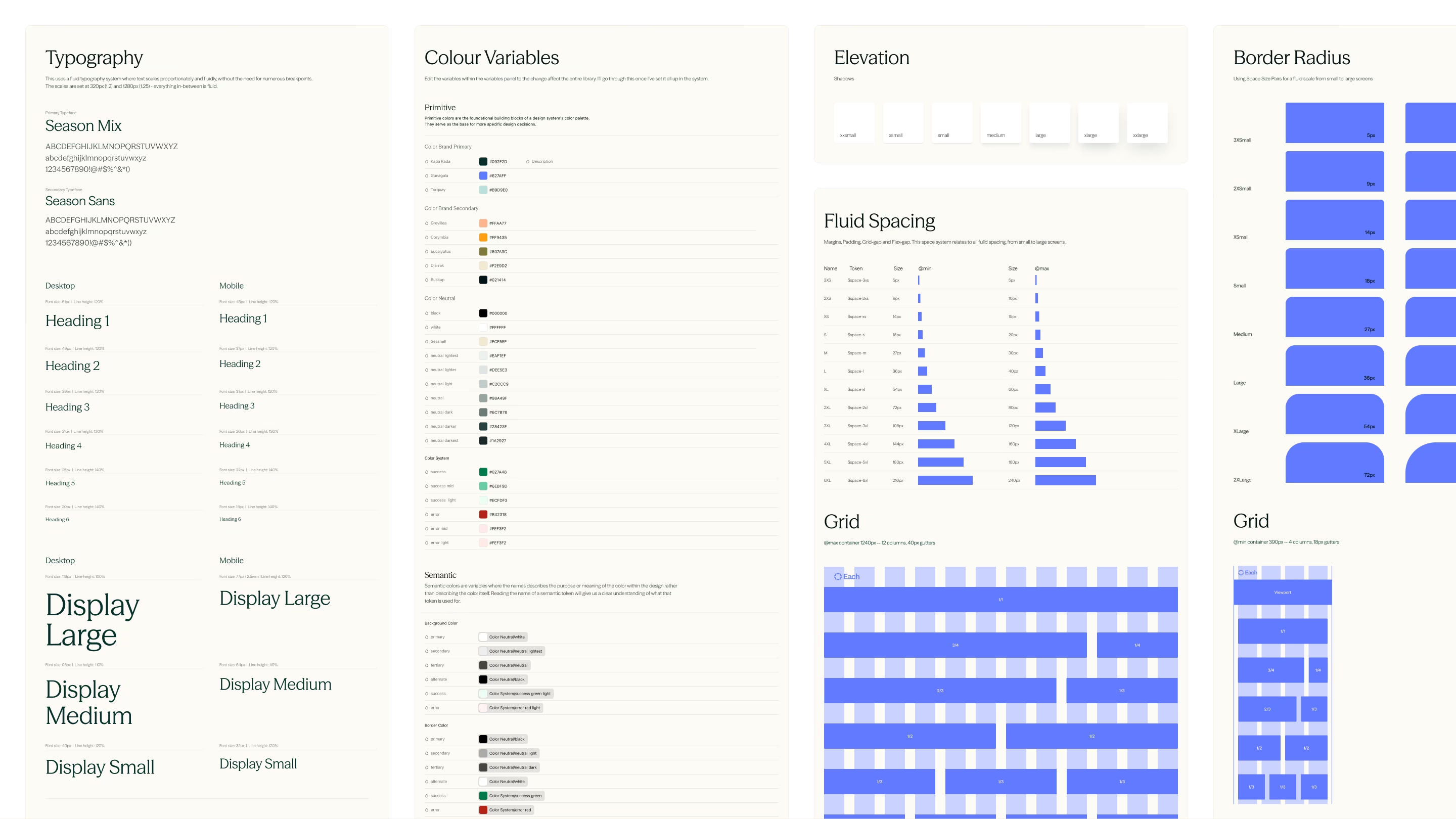
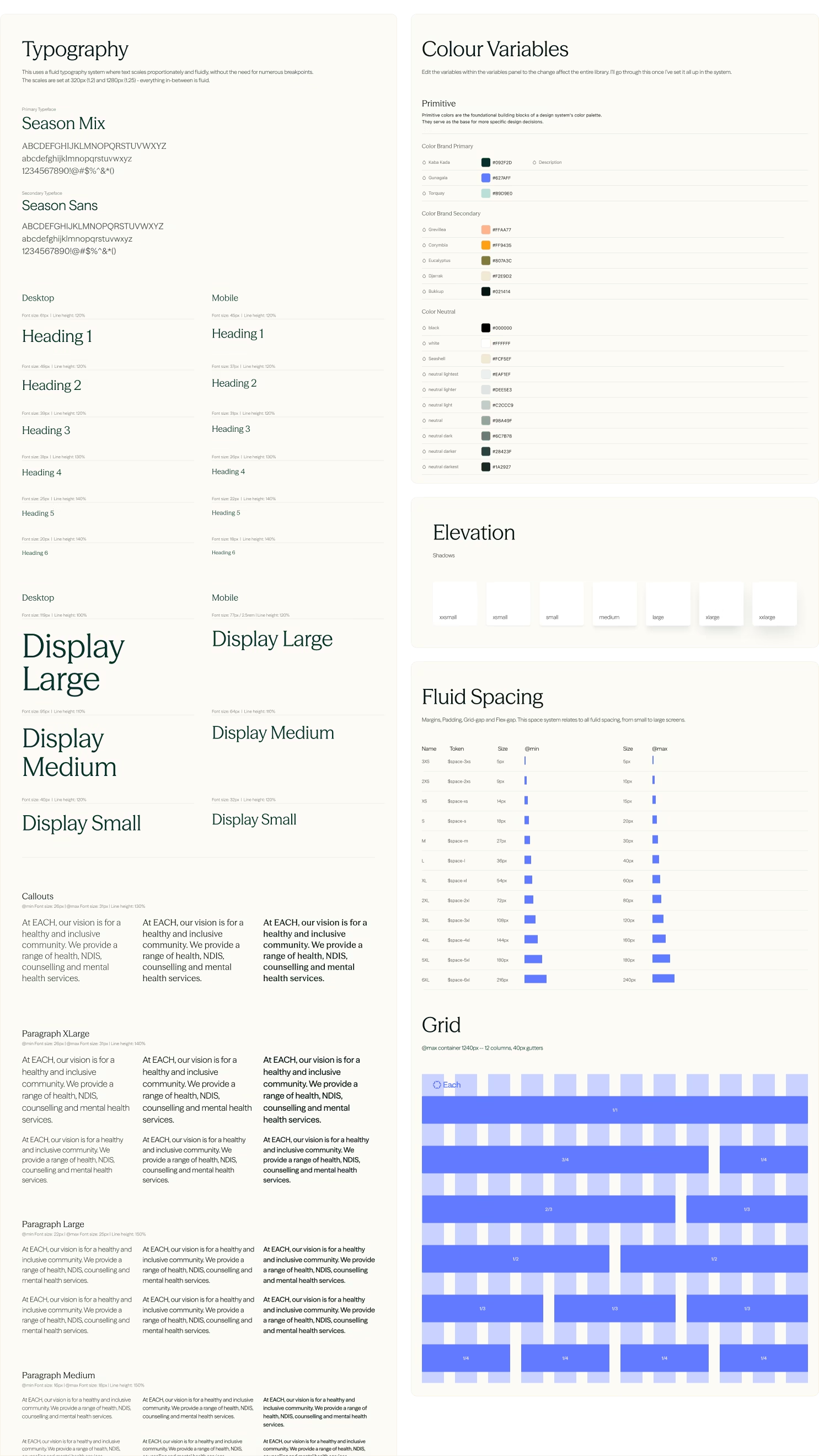
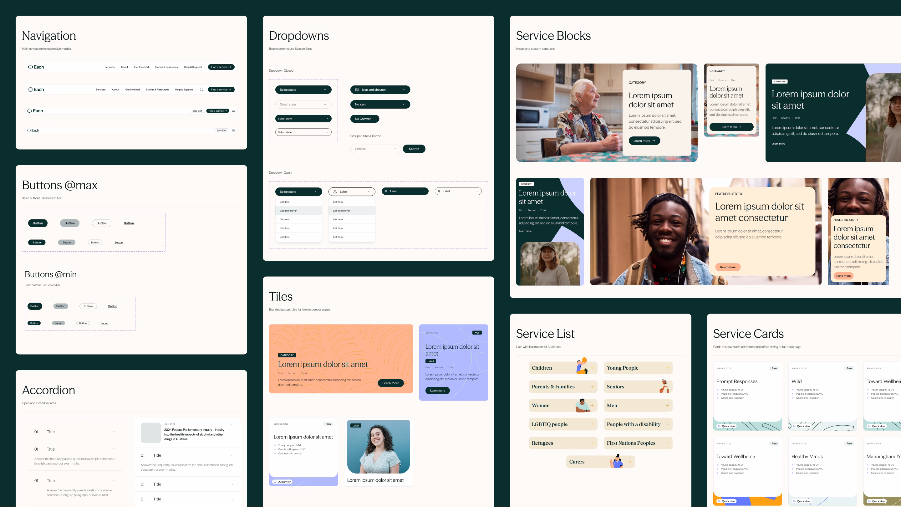
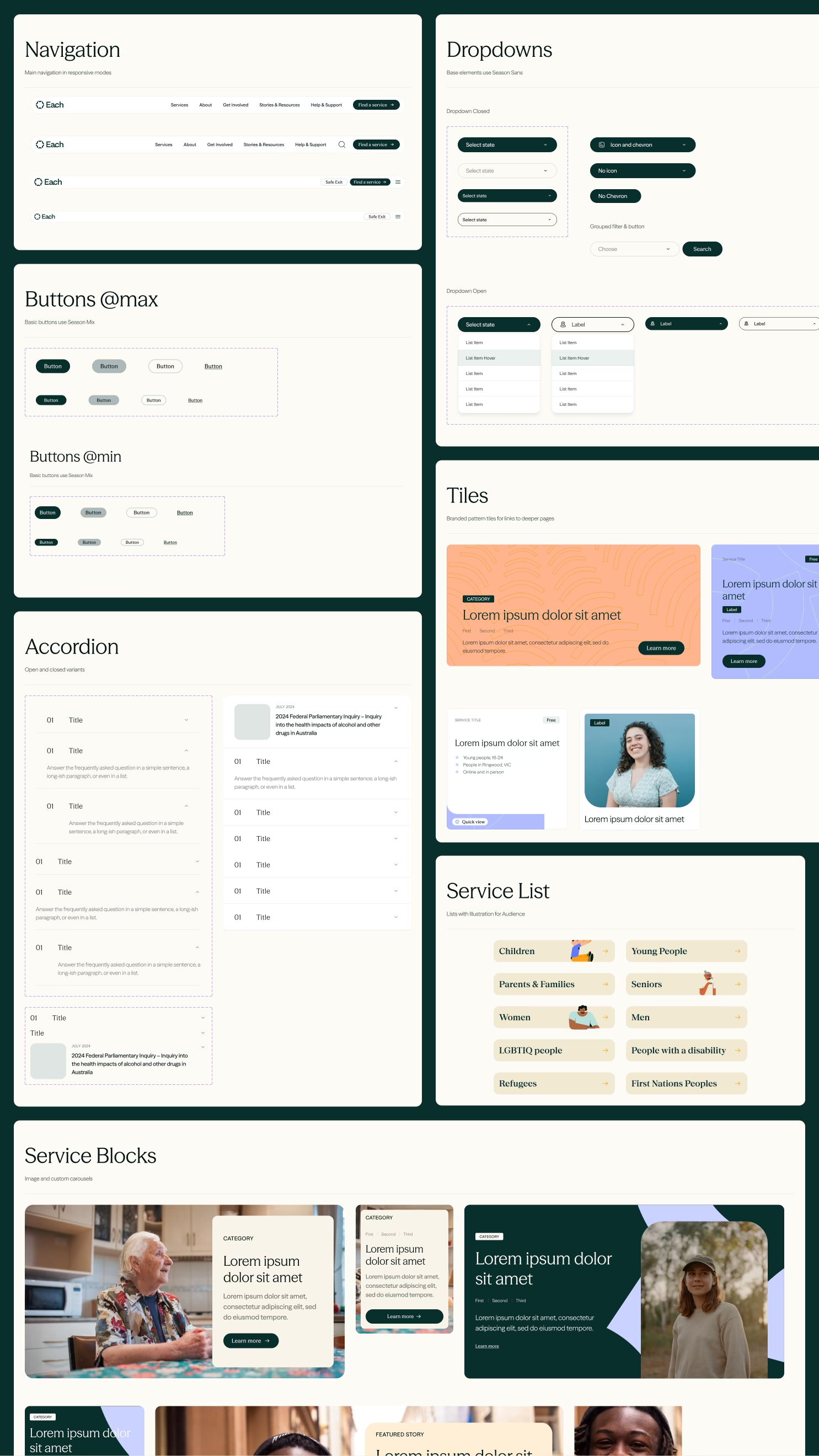
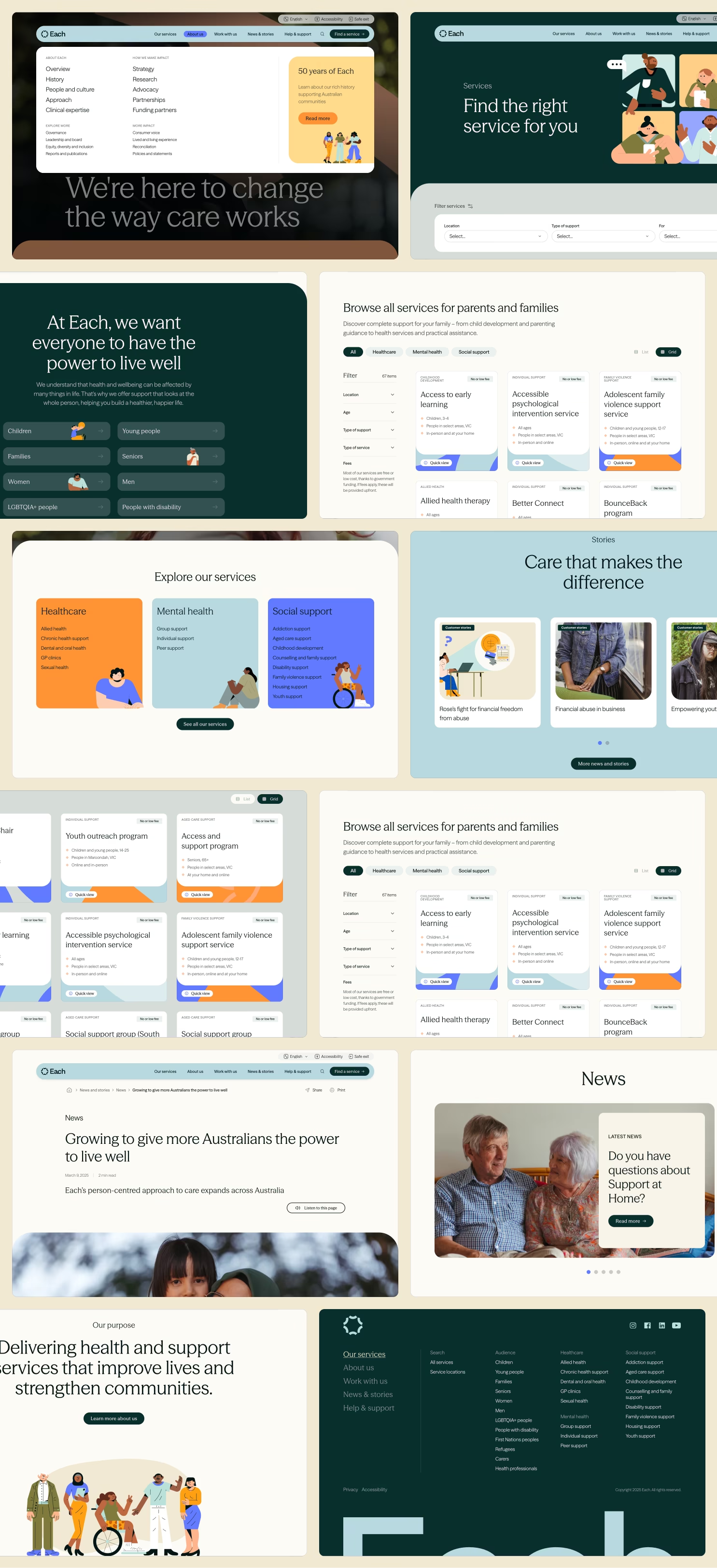
Working closely with the brand and development teams, patterns were refined in parallel with implementation. Using Utopia.fyi, a fluid typographic scale was established to maintain visual harmony across all breakpoints. From there, a modular component library was formed, including buttons, cards, forms, accordions and navigation, each with defined states, variants and usage rules.
Design Execution
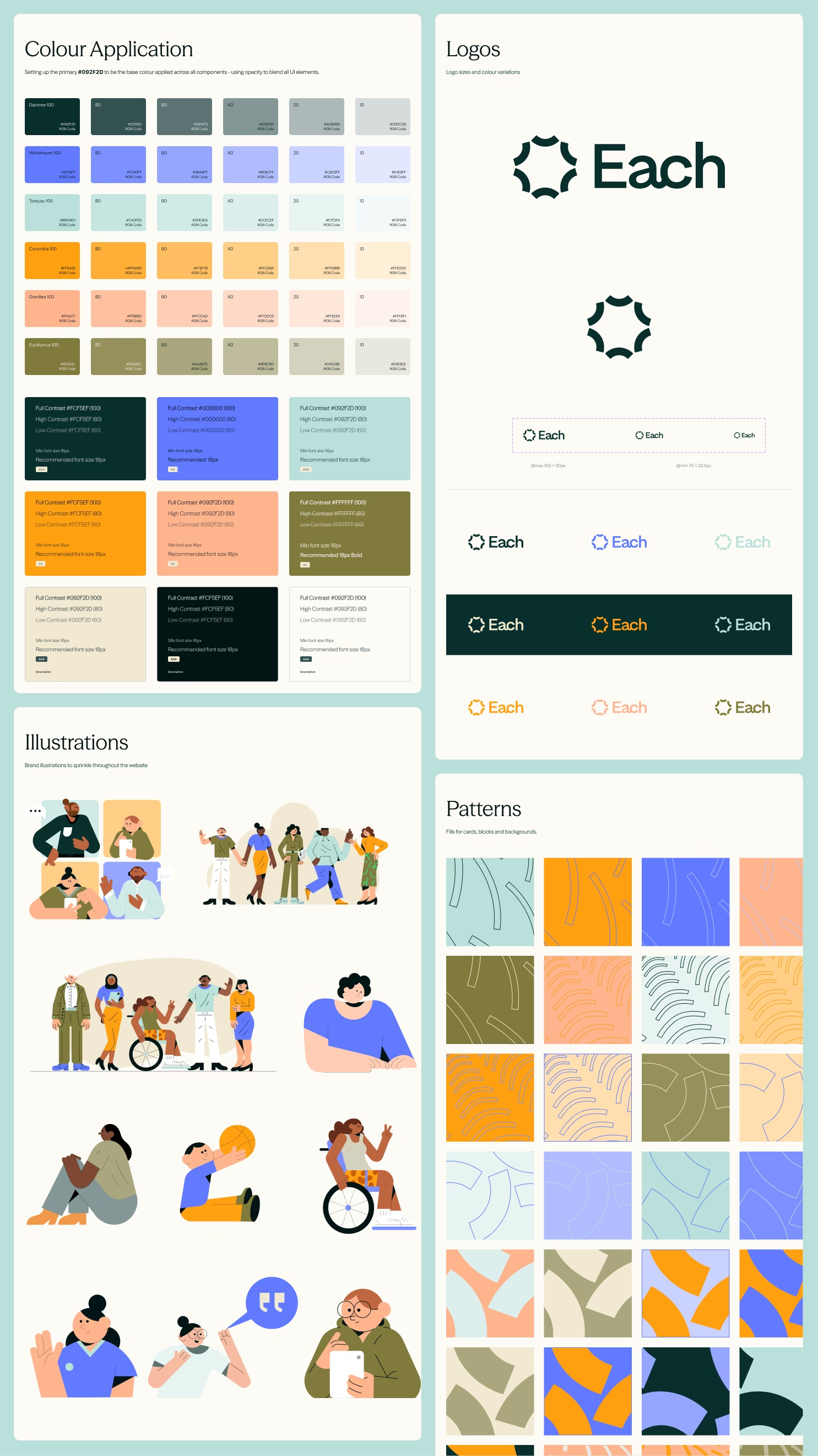
Foundation Styles
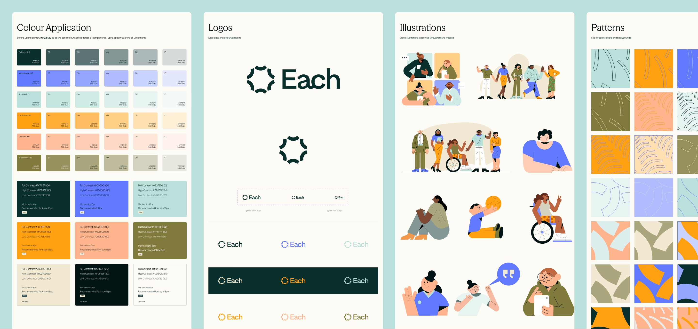
The foundation styles were built around a fluid typographic scale, ensuring seamless readability from mobile through to large desktop displays. A bold brand palette was translated into an accessible digital system, with WCAG-compliant contrast ratios and clear hierarchy to support users across all contexts.
Brand Application
Brand elements were applied with restraint to keep the interface warm, modern and easy to navigate. Focus states, keyboard navigation and responsive behaviours were intentionally designed to support CALD and low-literacy audiences, ensuring the experience remained inclusive and intuitive.
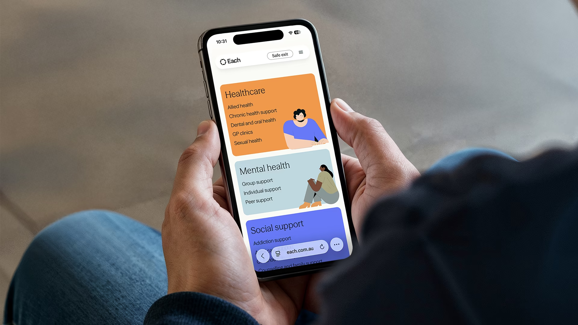
Component Design
The component library was constructed as a fully modular system, with patterns for buttons, cards, forms, accordions and navigation. Each component included defined variants, interaction states and motion guidelines, creating a scalable UI language that remained consistent, flexible and developer-friendly.
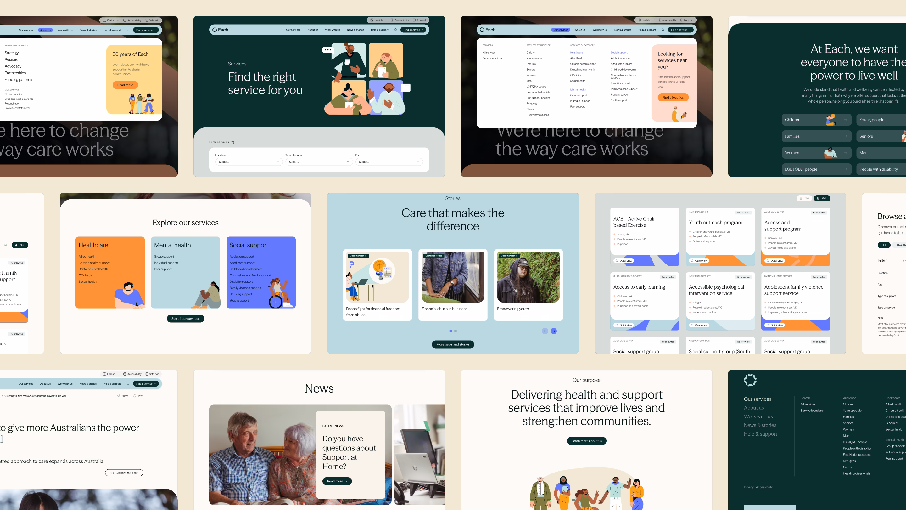
Applied layouts
Visit the EACH website to see the final result, or view the full brand case study by Superunknown.
Final Outcome
The result was a responsive, human-centred UI that brought consistency and clarity to a complex healthcare site, streamlined workflows between UX and development, and established a modern, accessible digital presence aligned with EACH’s national strategy. The redesigned system now gives EACH a platform that feels approachable, trustworthy and ready to scale with their future growth.
Bluntmedia proved to be a great connection between UX, Brand and Development. The design system provided an easy-to-implement responsive system that just worked.
- Paul H, Co-Founder, Superunknown
This is a confidential project under NDA
Client context
Harvest Technology builds low-latency remote streaming solutions for industries where live video, audio, and data need to travel reliably from the field to decision-makers. NodeStream is their flagship SaaS platform, enabling real-time remote operations across defence, mining, offshore, and industrial environments.
Our Role
Bluntmedia embedded directly into Harvest’s product workflow, collaborating day-to-day with engineers and stakeholders. We focused on understanding the realities of remote streaming, including latency, signal reliability, multi-input management, and operator usage during live sessions.
Want the full story?
We can walk you through the project in a private video session. Get in touch.
Your information has been saved.
Looks like we're having trouble