EnsureFlow Digital Product
Streamline a workflow for Claims Management Software
UX Design
Interaction Design
Design Research
Goals
01
Create a modern and consistent UI across the SaaS platform
02
Develop a flexible design system that simplified components for faster development.
03
Create an inspector-focused app prototype that improved speed and data accuracy on site.
04
Apply the refreshed brand identity so it felt credible, trusted and industry aligned.
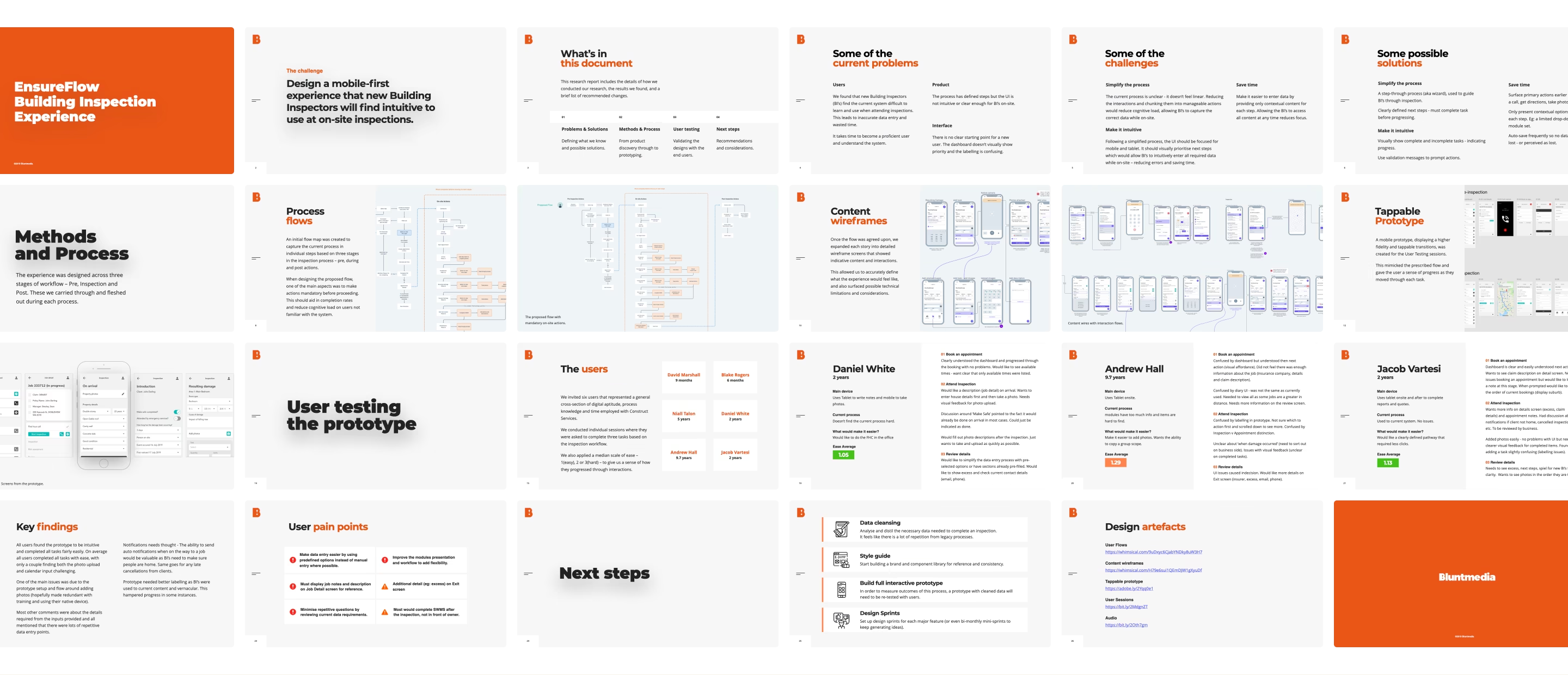
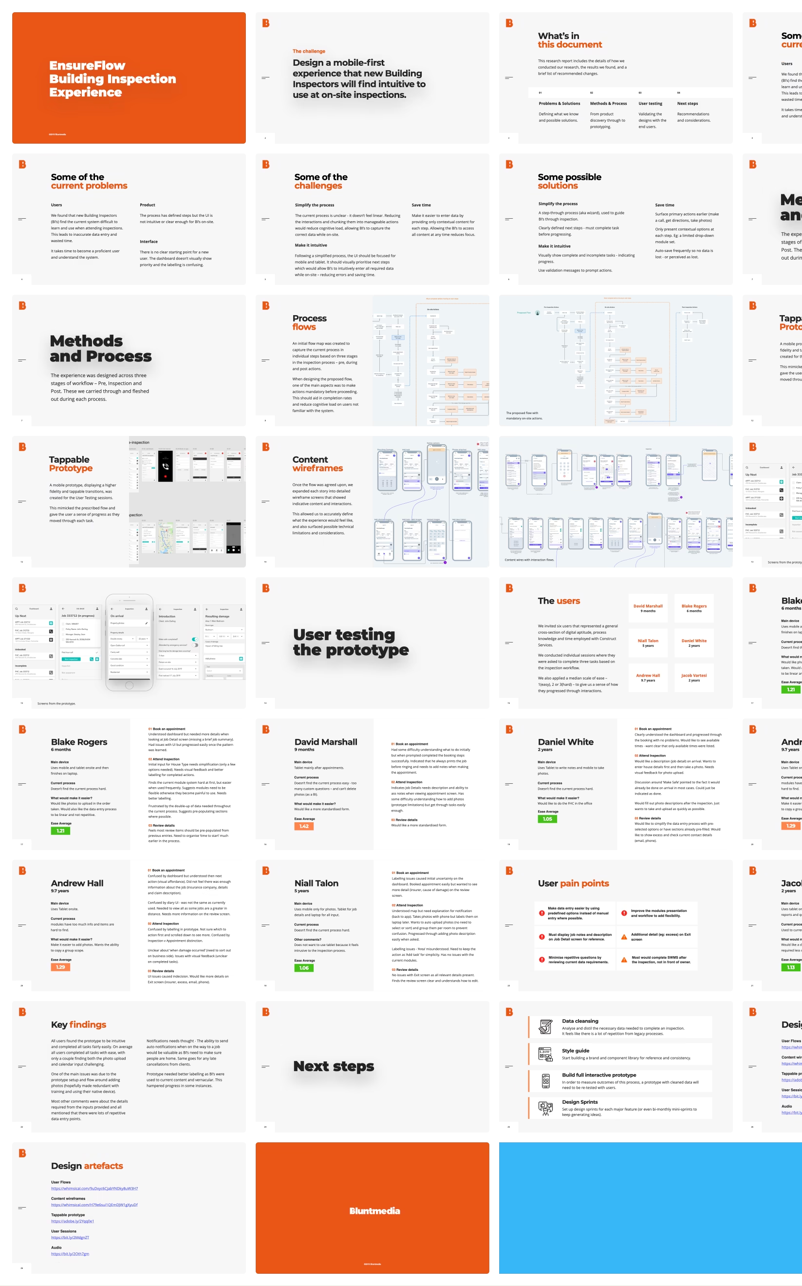
Research and discovery
We began by mapping existing product flows and identifying key pain points. This was supported by interviews with inspectors and admin users to understand how their workflows differed in the field versus the office. The existing UI was audited for inconsistencies, accessibility issues and redundant patterns, and a review of competitor products and broader field-service tools helped establish best practice benchmarks.
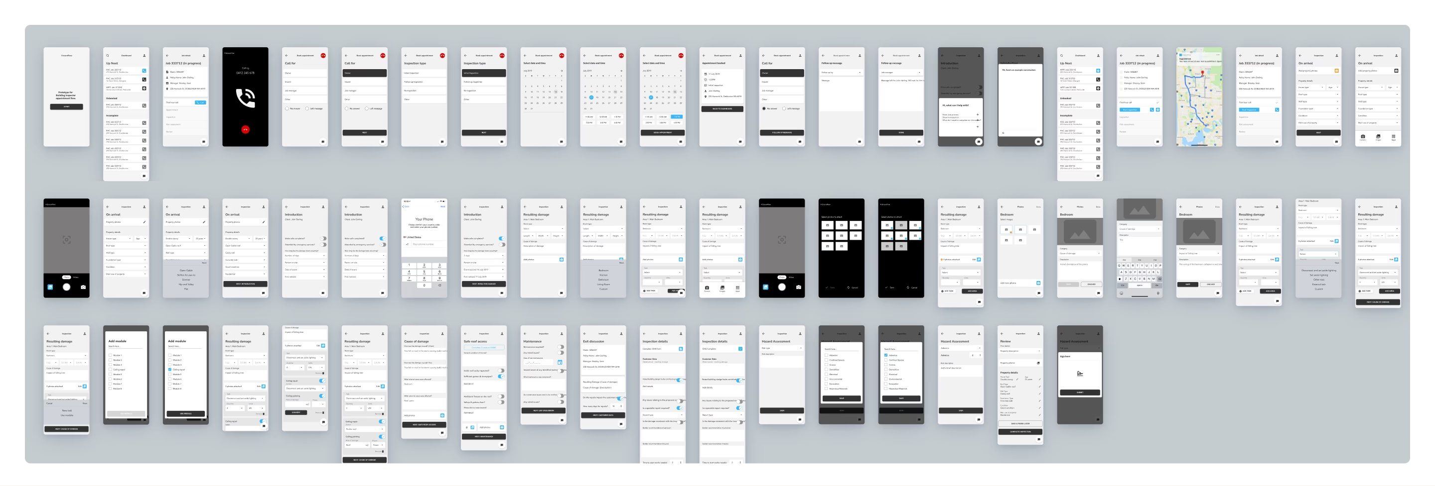
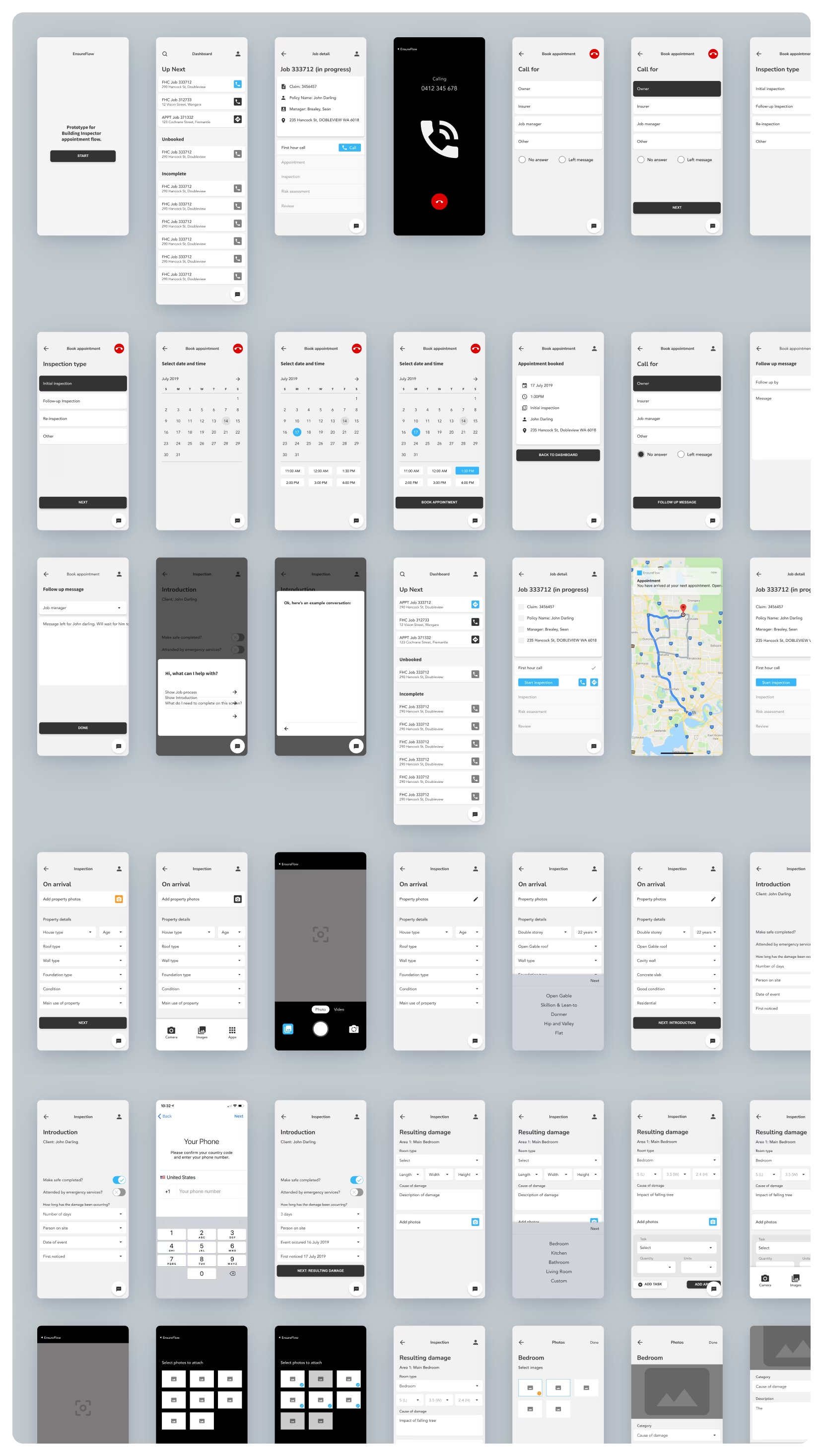
Inspection App Prototype
The mobile prototype was designed for outdoor conditions and fast on-site tasks, with a simple step-by-step flow and minimal screen clutter. Quick actions for photos, notes and defect tagging, along with smooth micro-interactions, helped match the natural rhythm of real inspections.
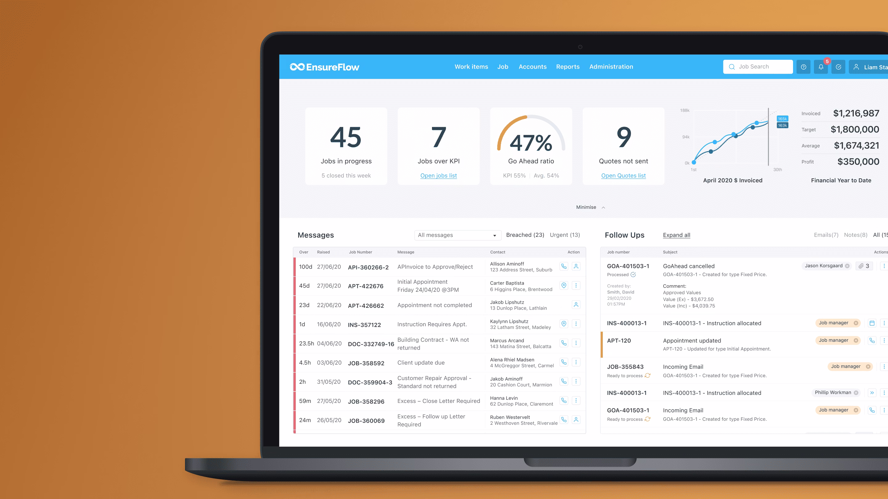
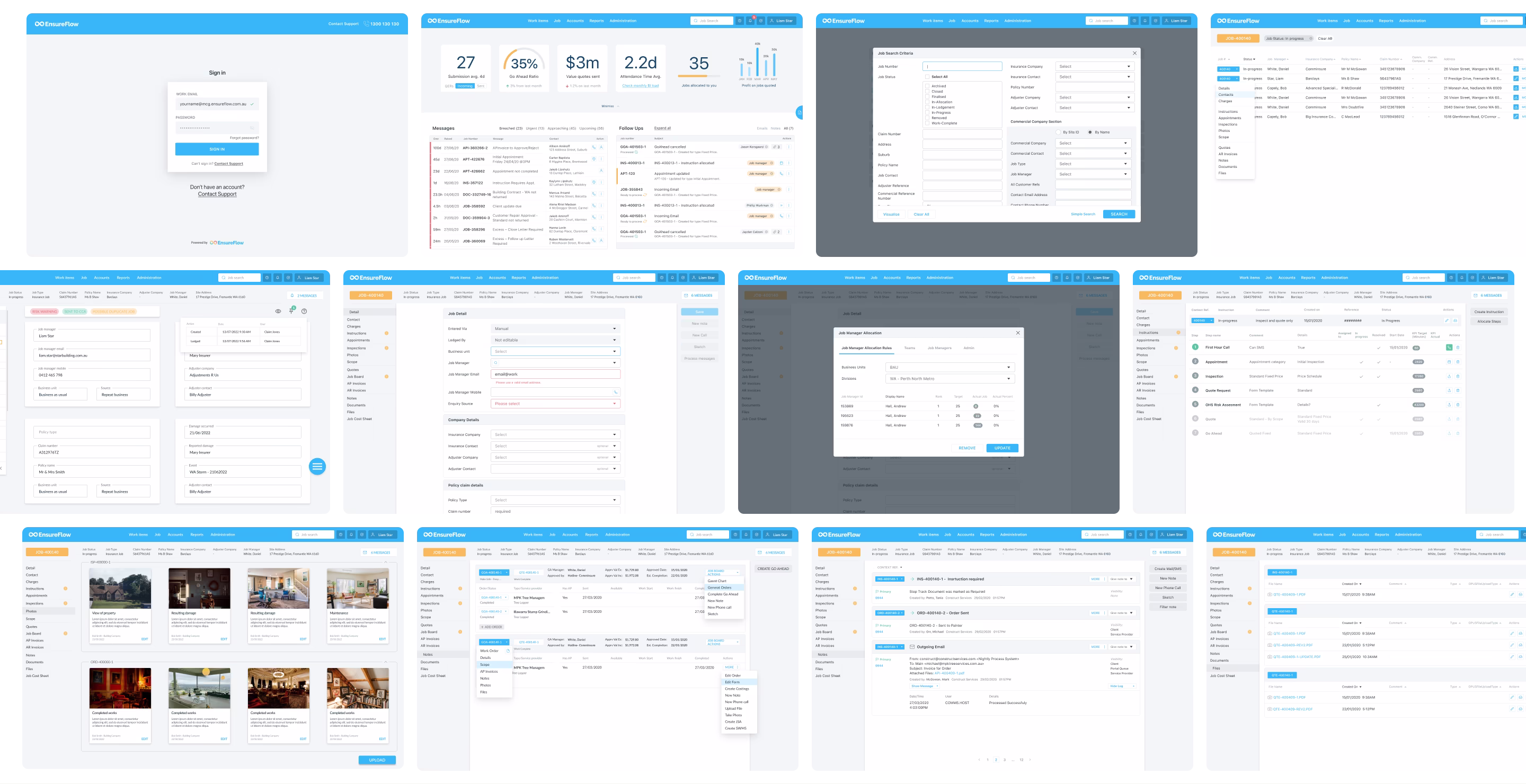
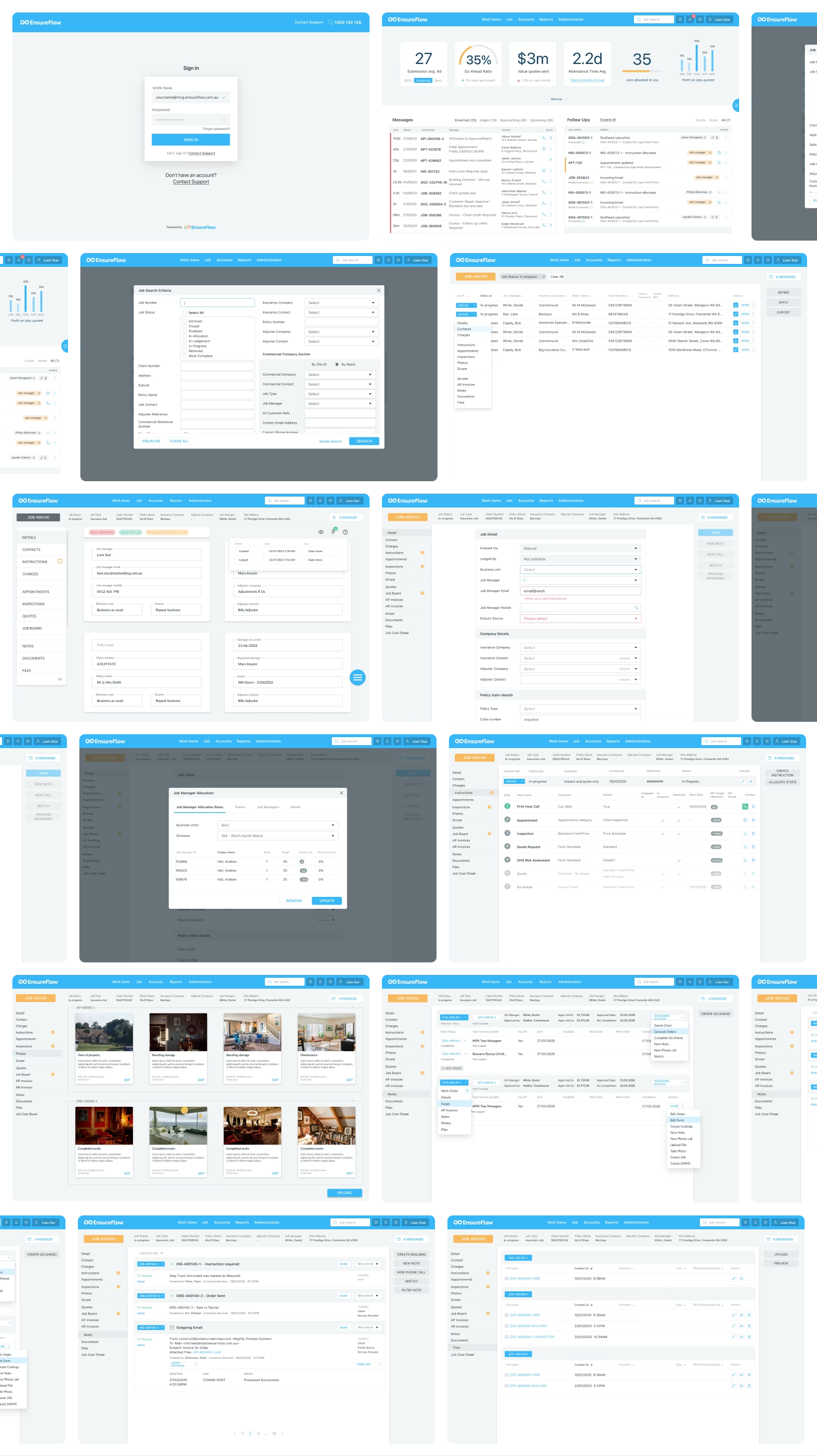
SaaS UI Refresh
The SaaS interface was updated with a cleaner, more modern look that removed visual clutter and improved hierarchy for complex data entry. New status logic and colour rules reduced ambiguity, and refreshed table patterns, grids and form inputs created a consistent and predictable user experience.
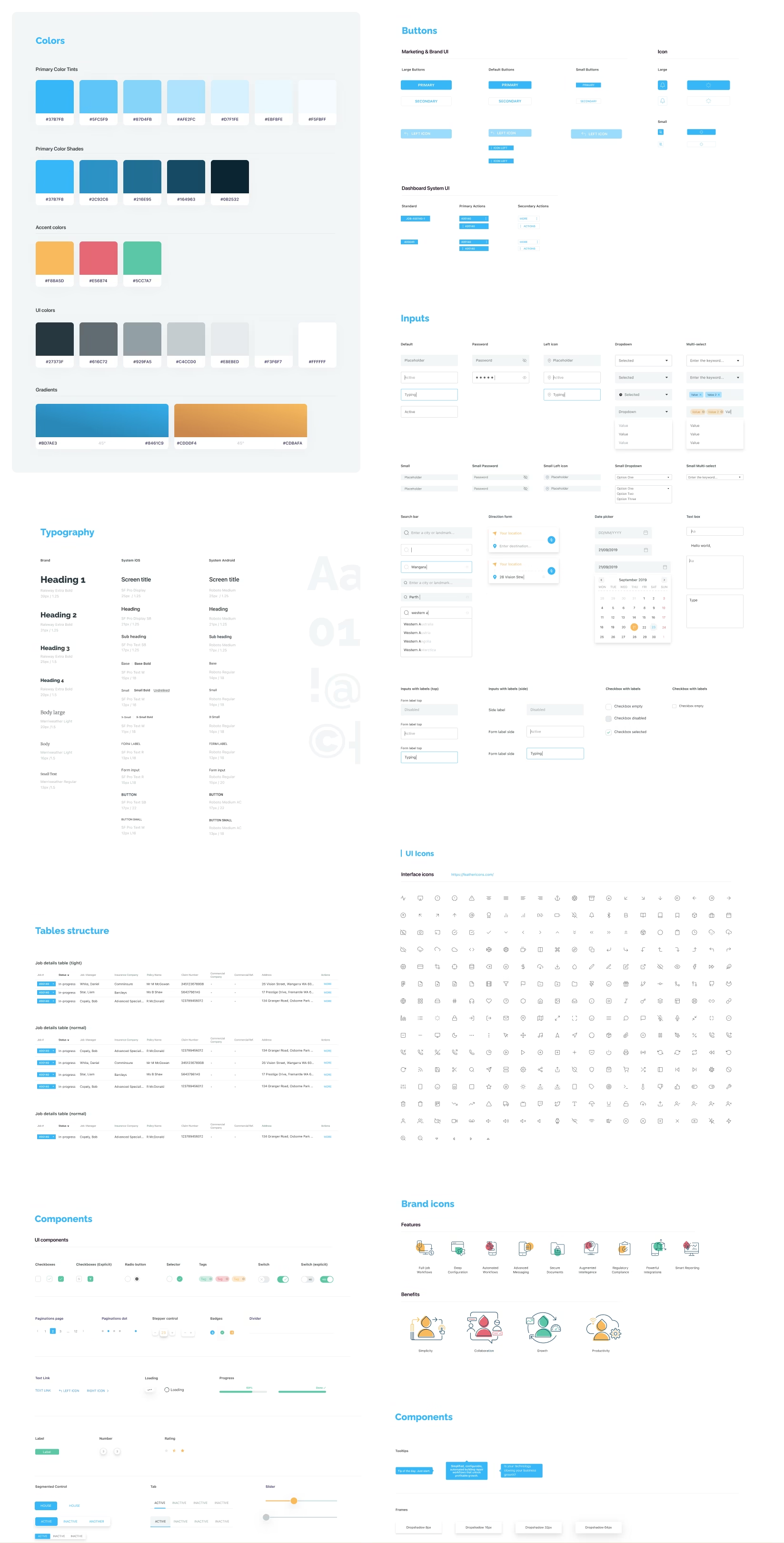
Component Library and Design System
A scalable Figma component library was created using tokens for spacing, colour, radius and shadows. Component behaviours and variants were documented to ensure alignment and smooth handover to development.
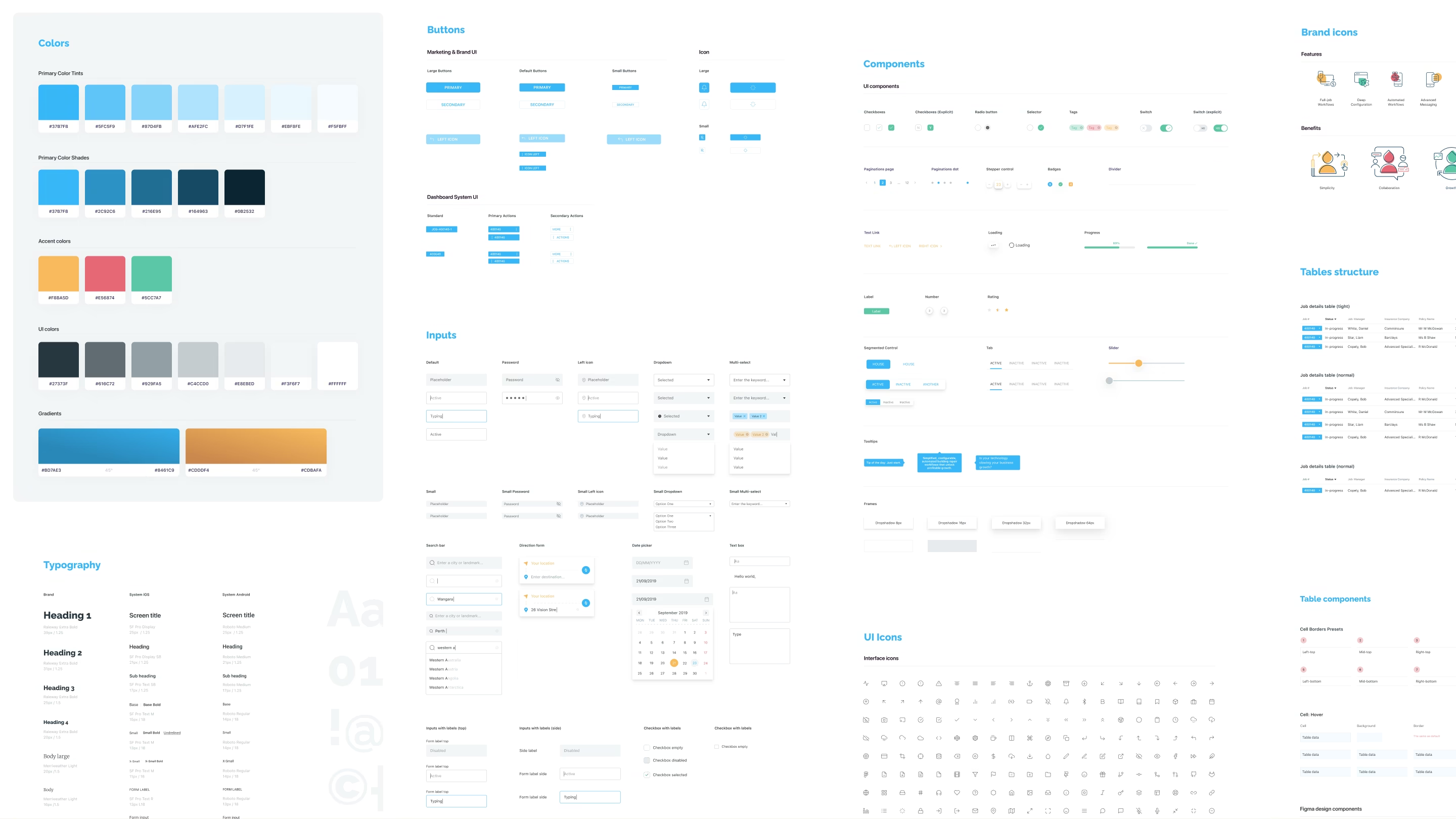
Modular component system
The interface was rebuilt around a lean, reusable component library. Standardised patterns were developed for tables, filters, status indicators, form modules and navigation states. Design tokens and clear component rules were documented for both design and development teams, ensuring alignment across builds and QA.
Final Outcome
The project delivered a cohesive product experience across the SaaS platform, mobile prototype and marketing site, supported by a streamlined design system that improved build efficiency and UI quality.
This is a confidential project under NDA
Client context
Harvest Technology builds low-latency remote streaming solutions for industries where live video, audio, and data need to travel reliably from the field to decision-makers. NodeStream is their flagship SaaS platform, enabling real-time remote operations across defence, mining, offshore, and industrial environments.
Our Role
Bluntmedia embedded directly into Harvest’s product workflow, collaborating day-to-day with engineers and stakeholders. We focused on understanding the realities of remote streaming, including latency, signal reliability, multi-input management, and operator usage during live sessions.
Want the full story?
We can walk you through the project in a private video session. Get in touch.
Your information has been saved.
Looks like we're having trouble